Design Insights December 29, 2025
By Zaina Rafique
Every year brings a new wave of UI/UX design trends aimed at improving user engagement and digital experiences. In 2025, several popular UI and UX trends gained rapid attention across websites and apps. But not all of them proved to be meaningful and hence did not sustain. These looked visually impressive at launch, but struggled with usability and accessibility.
At SandCup Design, we analyzed the UI/UX trends of 2025 that sadly, won't be prevalent much in 2026.
Ultra-Light Contrast Interfaces
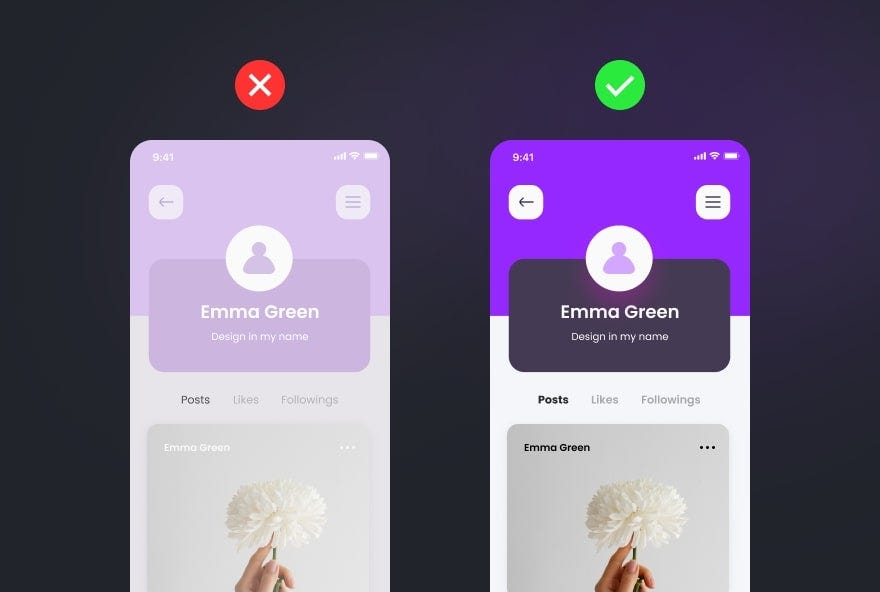
In 2025, many websites and apps used very light text on light backgrounds to look clean and modern. Designers leaned heavily into pale backgrounds, soft grays, and low-contrast text to achieve a “premium” look. While it looked stylish, it became hard for users to read, especially in bright sunlight or on smaller screens. For example, some banking apps tried very pale text for a premium look, but users found it difficult to see important details. This trend faded because good UI/UX needs readability and clear design.
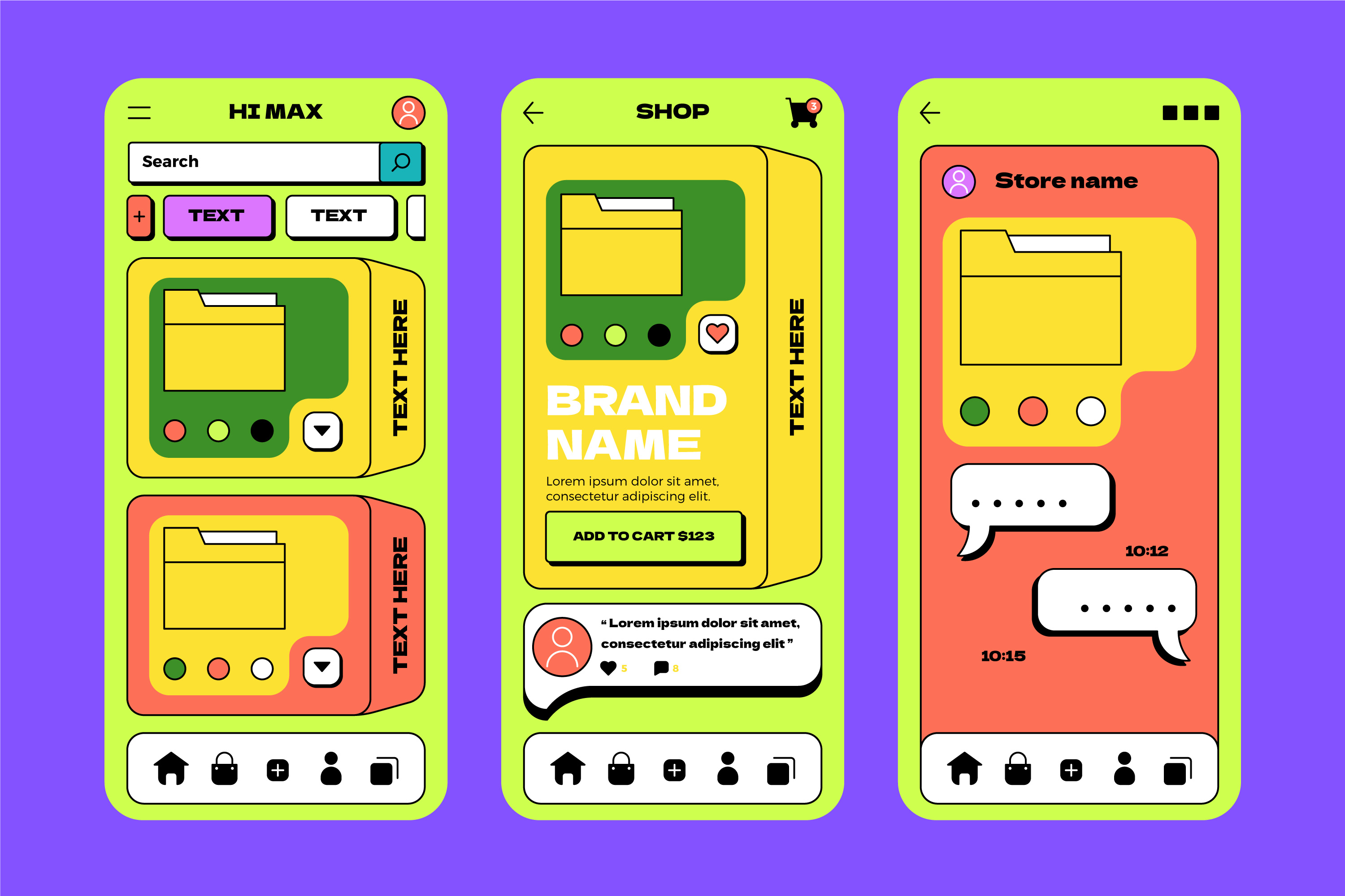
Oversized Hero Typography in Apps
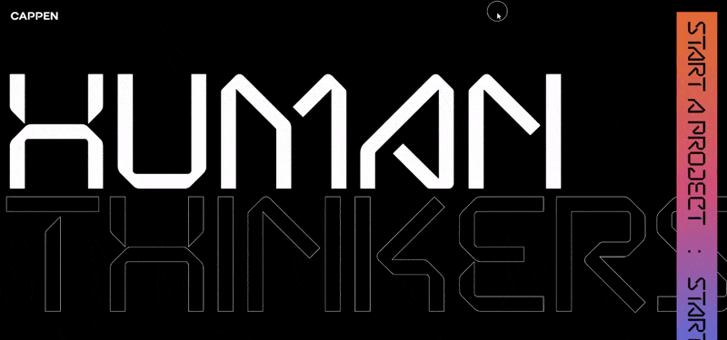
Huge, bold headlines were a big trend in apps and landing pages in 2025. Designers thought it would grab attention, but often it ended up pushing essential content too far down the screen. Users had to scroll more to reach buttons or forms, which made navigation slower. This trend lost popularity as designers returned to balanced typography that combines style with easy readability.
Glassmorphism UI Layers
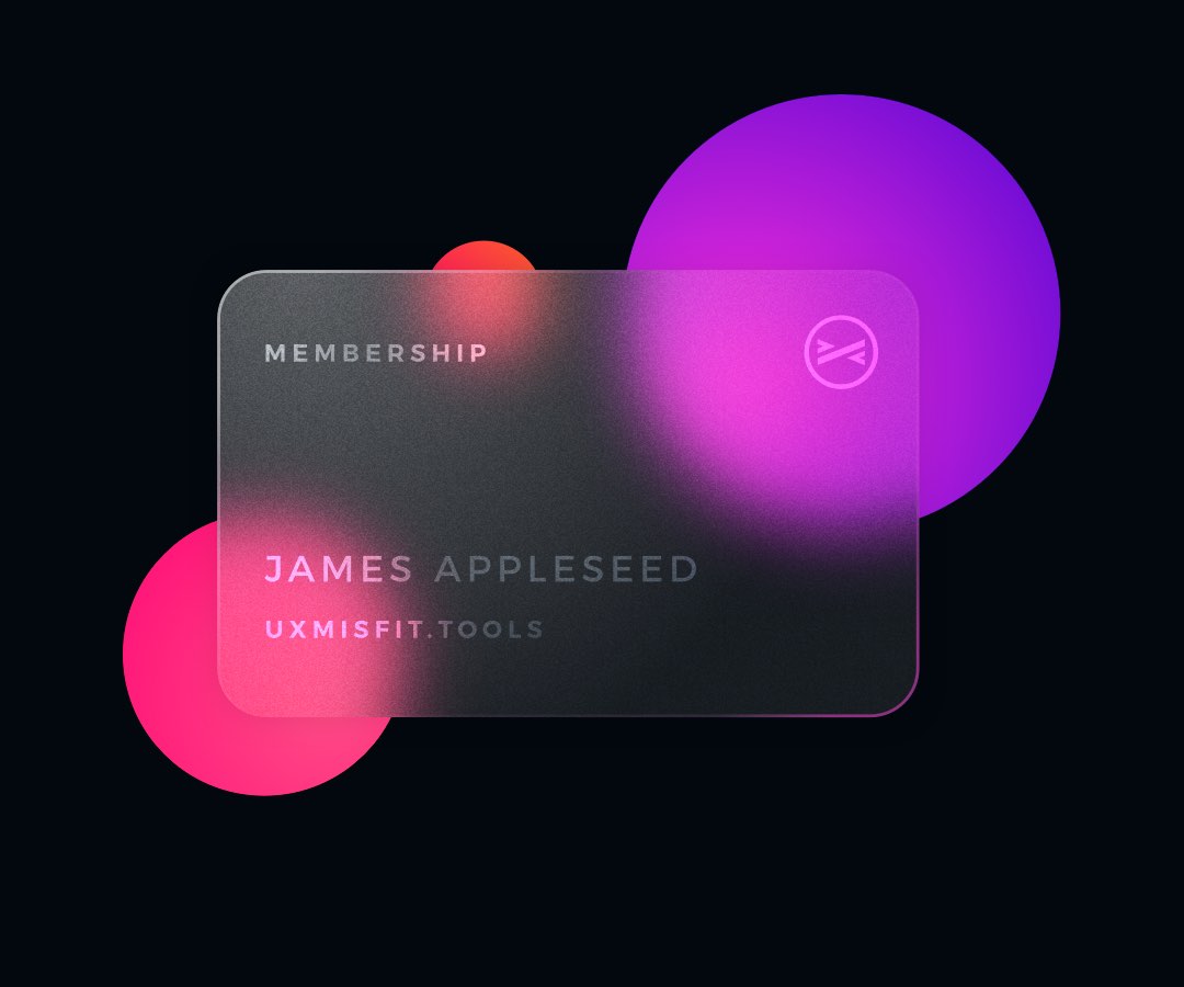
In 2025, many apps and websites started using glassmorphism, a design style with frosted, semi-transparent panels that gave interfaces a modern, layered look. It looked stylish and futuristic, and designers loved how it added depth to dashboards, cards, and menus. However, in real use, it often created problems. Text on these semi-transparent layers could be hard to read, especially on smaller screens or bright sunlight. Users sometimes got confused about what was clickable or where to focus. Over time, designers realized that clarity and usability are more important than just looking trendy, so many switched back to simpler, solid panels that made navigation and reading easier for everyone.
Over-Animated Micro-Interactions
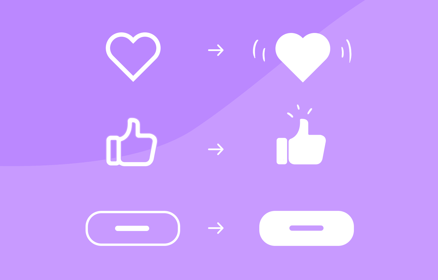
Micro-interactions, like small button animations or loading effects, are meant to make apps feel more interactive. In 2025, some apps went overboard with exaggerated movements and constant animations, which ended up confusing users and making tasks slower. The lesson from this trend is clear: animations should help users complete actions, not distract them with unnecessary motion.
Brutalist UI Experiments
Brutalist UI is a design style that focuses on raw, bold visuals. It often uses sharp grids, clashing colors, oversized elements, and intentionally rough or unfinished layouts. In 2025, some websites and portfolios adopted this style to stand out and grab attention. This “visual shock” means the design is meant to surprise or jolt the viewer with bold contrasts, unusual layouts, or unexpected colors. However, many users found these interfaces confusing and hard to navigate, especially on apps or business websites where clarity is key. Because the style focused more on shocking visuals than on usability, the trend did not last.
Final Thoughts from SandCup Design
The UI/UX trends that faded in 2025 shared a common flaw: they prioritized novelty over usability. The trends that survived were those grounded in clarity, accessibility, and real user behavior.
At SandCup Design, we believe strong UX is quiet, intentional, and built to last, not simply built to impress.
Be a part of our world and gain more insights on design and innovation!