Design Insights January 06, 2026
By Zaina Rafique
The Pantone Colour of the Year 2026 has got the design world talking. Apart from being merely a visual trend, it is said to have the potential in how brands design identity, products, and systems. While being celebrated for the same potential, the colour has also faced criticism, raising important questions around cultural relevance, accessibility, and long-term value for brands.
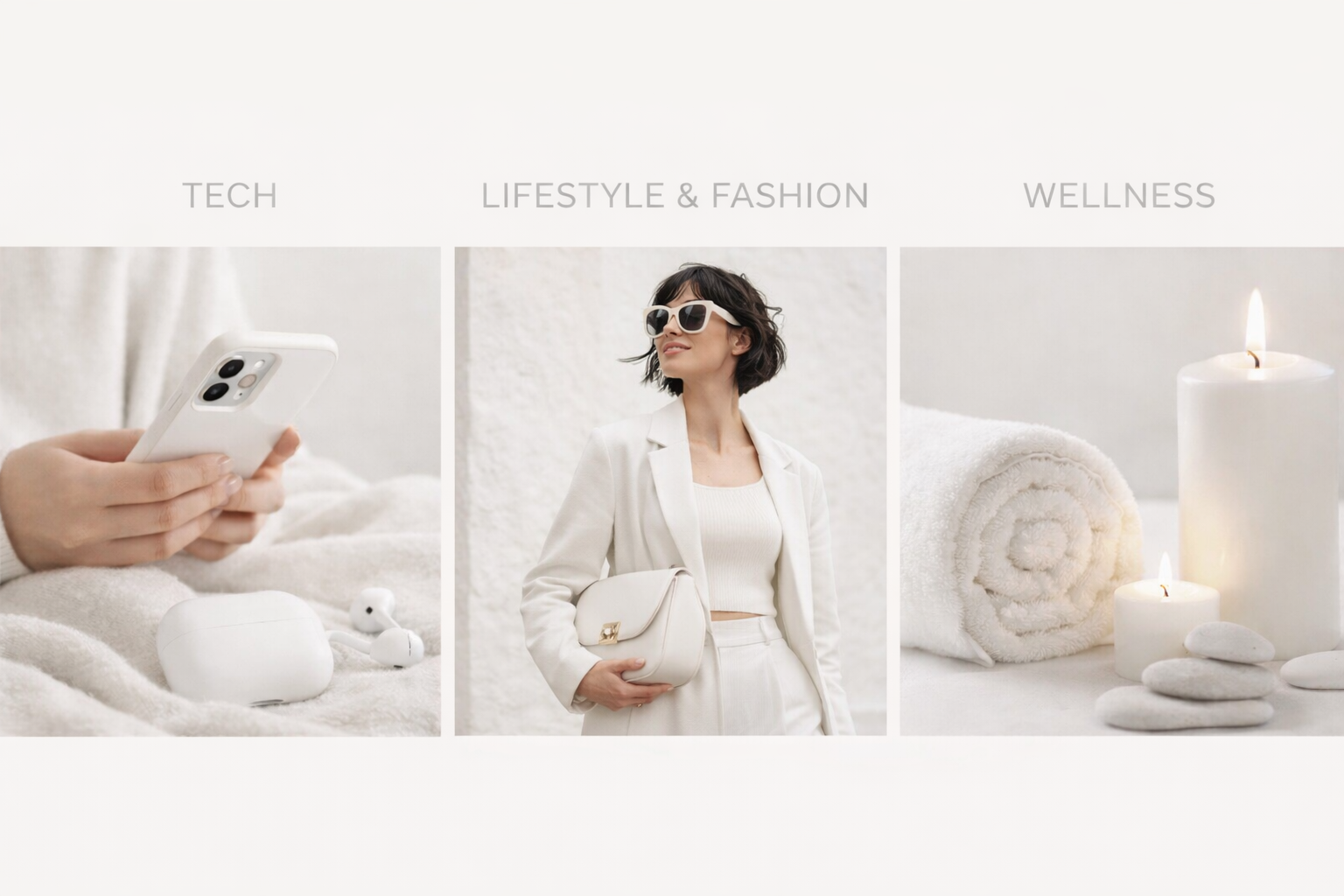
Industries That Can Build Systems and Digital Products with this Colour
The Pantone 2026 colour is not suitable for all industries, but some can surely adopt it. Tech companies can use it within UI design or interactive elements. Lifestyle, fashion, and culture brands can experiment with seasonal campaigns, limited-edition products, or marketing visuals where flexibility is expected. Wellness brands can use it in neutral palettes for a softer mood and light communicative elements. In these industries, the color can function as a supporting medium within brand systems than a core identity shade.

Design Interpretation and Color Psychology in India
The emotional and cultural interpretation of Pantone’s 2026 colour varies by region. In India, colour carries deep cultural and symbolic meaning, which differs majorly from that of Nigeria. A hue that feels fresh in Europe may come off as dull in Indian contexts. Designers must consider saturation, contrast, and cultural resonance, especially in digital products where accessibility is critical. Thoughtful adaptation here, based on regional beliefs, becomes necessary. Hence this color could not be the knight in shining armour for Indian brands.
Criticism and Limitations
Despite the buzz, the colour has faced criticism from designers. Many argue that it is difficult to scale across large brand systems, lacks sufficient contrast for accessible experiences, and risks visual fatigue if overused. Certain industries may find it incompatible with their goals. Financial services and fintech, for example, rely on trust and clarity, while legacy brands require neutrality. In these cases, adopting the color could feel forced, misaligned, and difficult for users with colour blindness.
What Pantone Should Do Better Next Time
Pantone has a significant influence on the design world. Hence, its process should be based on accessibility, regional symbolism, and system applications. By doing so, the decided colour would be more actionable. By bridging aesthetics with usability, Pantone can maintain relevance within human-centered design.
Conclusion
It may seem cool, but the Pantone Colour of the Year 2026 cannot be a branding mandate. Its value depends on how thoughtfully it is adapted. Brands that use it strategically can enhance their visual identity and storytelling, while those that adopt it blindly risk being superficial.
Be a part of our world and gain more insights on design and innovation!


