Design Insights August 14, 2026
By Zaina Rafique
A few years ago, a major rebrand felt like a rare event.
Now, it feels like every few months a familiar brand returns with a cleaner logo, a sharper typeface, a softer colour system, and a launch film that says the company is entering a new chapter. Sometimes the shift feels necessary. Sometimes it feels like the brand simply removed half of its personality.
Still, the pattern is pretty evident.
Big brands are rebranding because their businesses are changing faster than their old identities can explain. They are entering new categories, speaking to wider audiences, becoming more digital, and trying to look ready for markets that no longer behave in one predictable way.
A rebrand, at its best, is a signal that the company has advanced. The question is whether the identity can carry that vision and purpose in a progressive way without diluting it.
The rebrand wave is trying to say something
Recent rebrands are rarely about logos alone.
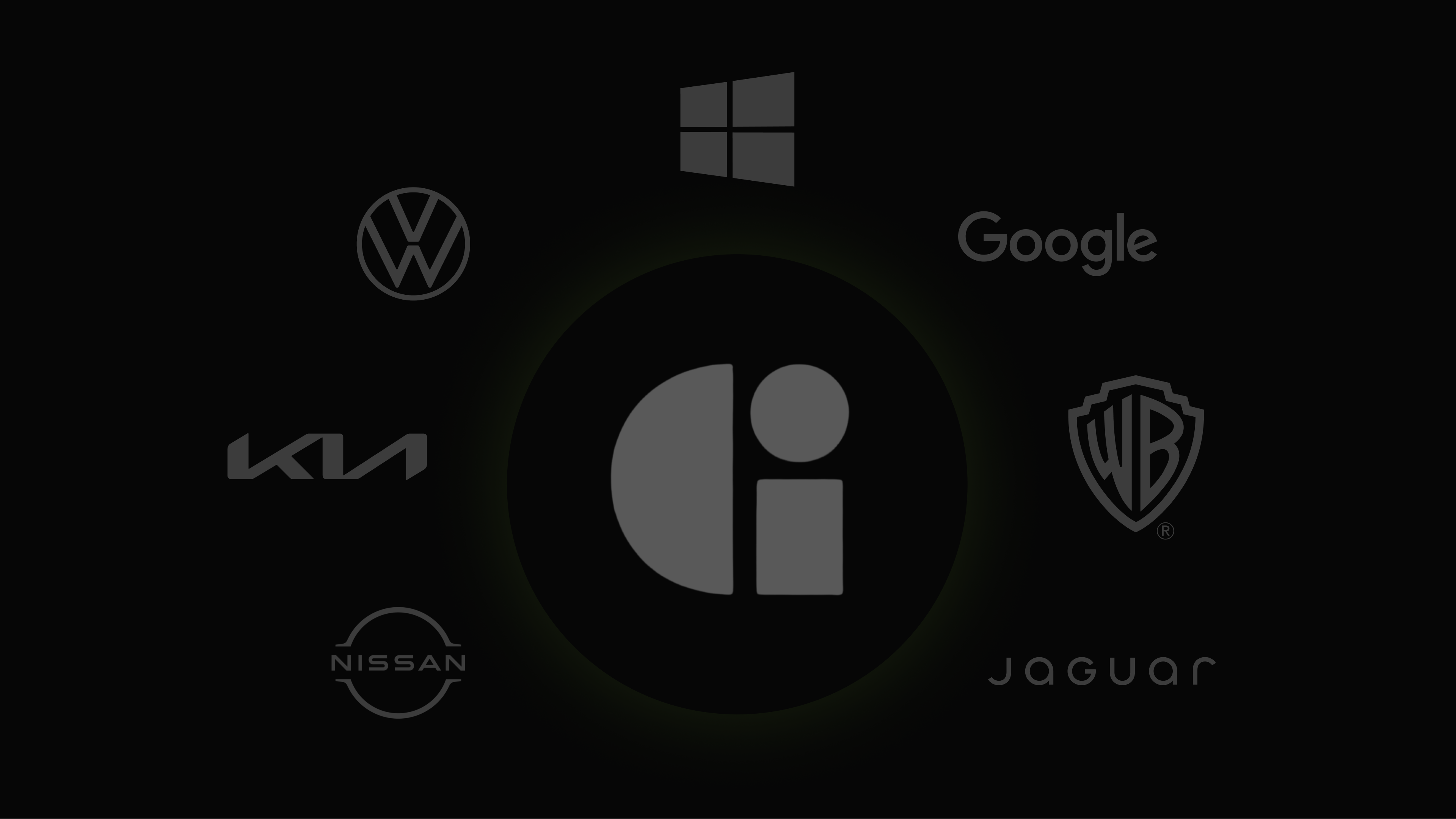
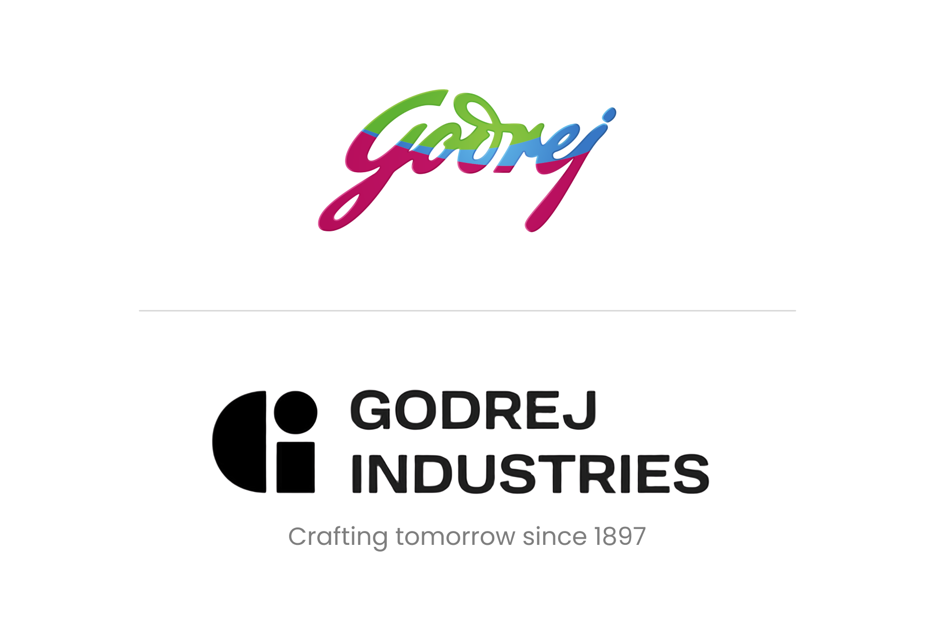
Godrej Industries Group’s refreshed identity arrived with the purpose line “Crafting tomorrow since 1897.” The system includes GI Sans, a sonic identity, and a signature fragrance, created to bring sharper coherence across businesses such as consumer products, real estate, financial services, agriculture, and chemicals.
Torrent offers a quieter example. Its recent electricity bills have moved from the older yellow-heavy format to a sleeker green and white design. That may look like a small visual update, but a utility bill is one of the most direct brand touchpoints a customer sees. It has to be readable, trustworthy, and easy to act on.
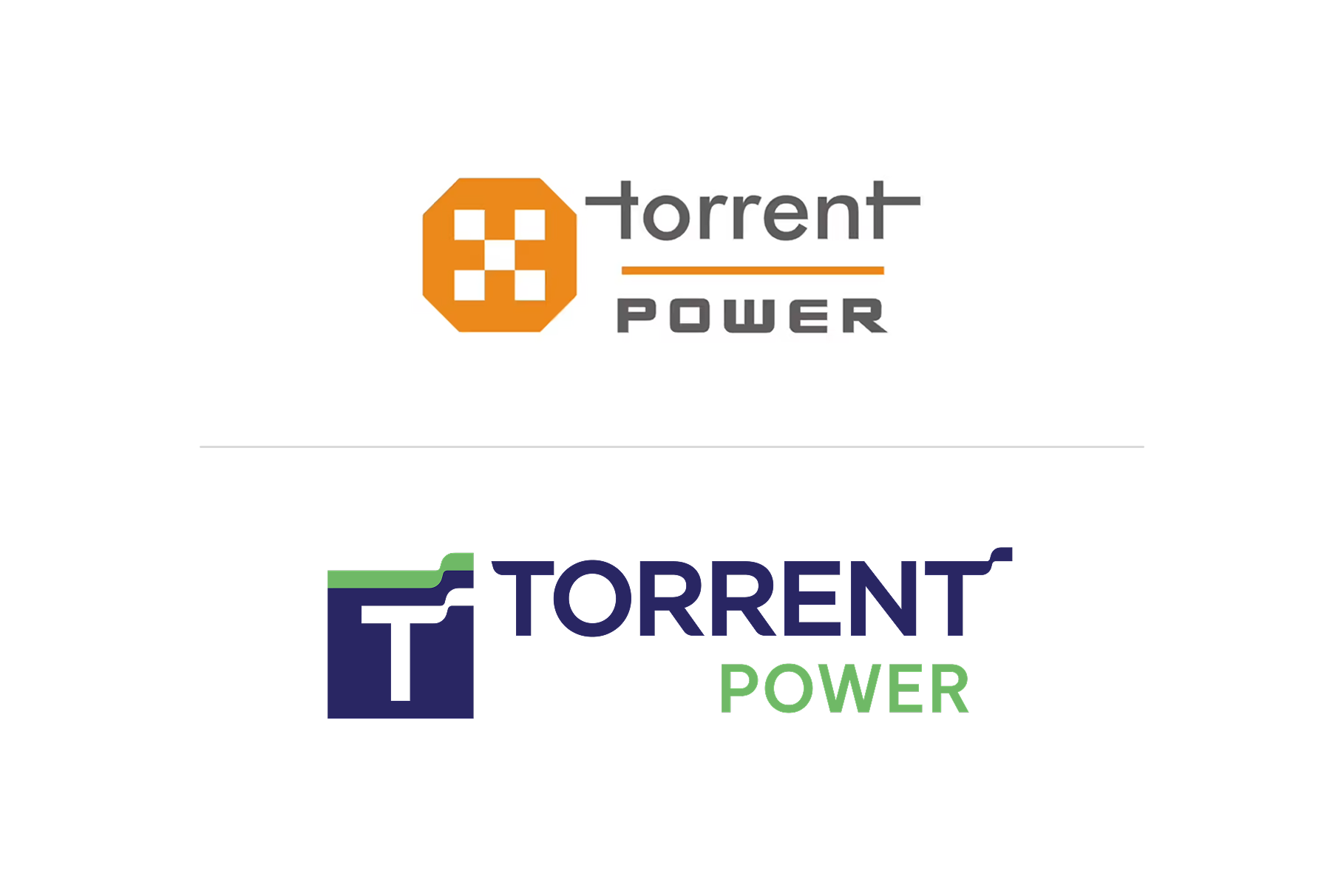
These examples are where rebranding becomes strategic. It helps the business say, “We are wider than before. We are clearer than before. We are ready to be understood differently.”
A new identity often follows a new business reality
Large brands reach a point where their identity starts carrying too many old assumptions.
A company that began in one category may now serve many. A brand built for physical stores may now live across apps, delivery, social media, and digital services. A regional or national brand may now want to speak across cultures, languages, and markets.
Walmart’s 2025 refresh was tied to its current role as a people-led, tech-powered omnichannel retailer. That is a very different brand reality from a store-first identity built for an older retail world.
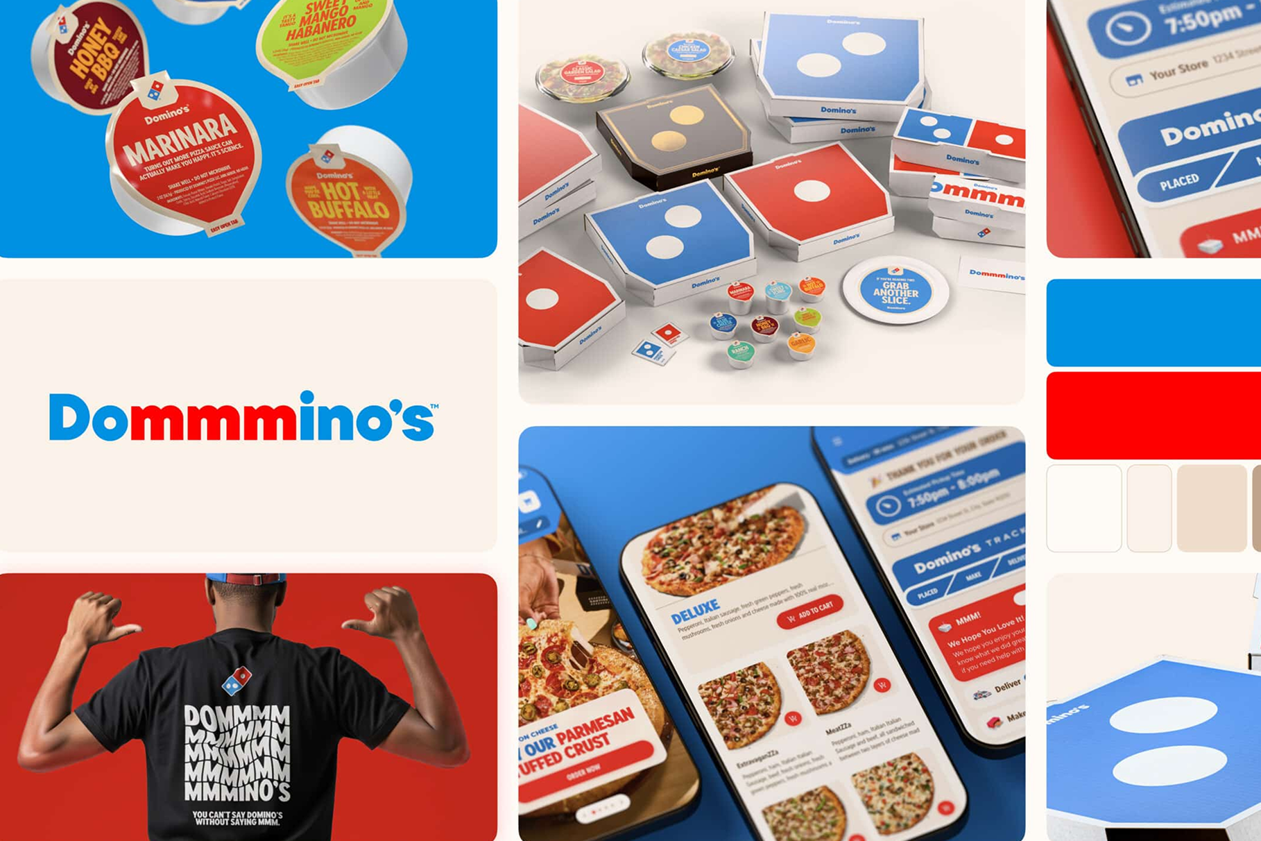
Domino’s also refreshed its brand in 2025 after 13 years, with updated packaging, brighter colours, a custom typeface, and a new jingle. The purpose was to make the brand feel more energetic and more appealing to a new generation of pizza lovers.
The challenge is making the change feel earned.
If people can see what changed in the business, the identity feels like a natural next step. If they only see a cleaner logo, the rebrand begins to feel cosmetic.
Bigger audiences need clearer systems
Another reason big brands are rebranding is reach.
A brand today may need to work across countries, cultures, age groups, languages, devices, accessibility needs, and attention spans. That is a lot of pressure for one identity system.
This is where accessibility and cross-cultural design become important.
A brand identity has to be readable on a phone screen, visible on packaging, clear in motion, flexible across scripts, and understandable in different markets. It has to work for people who meet it in a store, on an app, in an ad, through a delivery box, or inside a financial report.
Minimal systems often help with this. They reduce clutter. They scale better. They make design easier to apply across large organizations. They can create a cleaner experience for people who are moving quickly, reading in smaller formats, or interacting across digital platforms.
So the pull towards simpler branding is understandable.
A cleaner identity can help a brand speak globally. It can make communication more consistent. It can give large teams a system that is easier to use without breaking the brand every time it appears in a new format.
That is the strength of modern rebranding.
The danger of becoming too widely acceptable
The concern begins when many brands start looking for the same kind of solution. Cleaner logos. Flatter symbols. Softer shapes. Neutral type. Fewer details. Safer colours.
All of this can make a brand look modern and easier to use across platforms. But when too many brands move in the same direction, they can start feeling similar.
This is where the Godrej conversation becomes relevant. After the launch of its new GI identifier, people on social media pointed out similarities with other identities, including Guerrilla Agency, Interdiscount, Gardenlust, and Cocoli Living. Godrej Industries Group clarified that the mark went through IP diligence and was meant to appear with the Godrej signature logo or company name.
The bigger concern is still worth looking at.
When a logo becomes too reduced, it has less room to feel different. A circle, cut, curve, or simple letterform can start reminding people of something they have already seen.
A rebrand can help a company speak to a wider audience. It can also weaken the visual memory that once made the brand easy to recognize.
That is the balance major brands need to protect.
Meaning should lead the redesign
A rebrand can open a new chapter.
Brand positioning decides whether that chapter still belongs to the same story.
At SandCup, we see a rebrand as a translation of change. When a business grows, the identity should make that growth clearer without losing what people already trust.
That is where positioning matters. It defines what should change, what should stay, and what must remain unmistakably yours. Simplicity works when it sharpens meaning. Without meaning, it only makes the brand look cleaner.
A rebrand can open a new chapter, but positioning keeps it connected to the same story. SandCup Design’s Brand Positioning work helps brands find that balance before the identity takes shape.
Explore Brand Positioning at SandCup
Be a part of our world and gain more insights on design and innovation!