
Design Insights August 13, 2026
By Zaina Rafique
Booking a ride to your destination has the same experience whether you’re trying to do it in Mumbai, Riyadh, Tokyo, London, or New York. Everyone hopes for the same thing: to safely get from one place to another without confusion. Uber was founded in 2009 in San Francisco, inspired by the frustration its founders faced while trying to find a taxi in Paris in 2008. Ever since then, Uber has worked to make the experience of booking a cab hassle-free for everyone across the world.

By building a highly adaptive service design, Uber has aced the cross-cultural adaptive model, making it one of the world's most widely used ride-hailing platforms!
Let's learn how they pulled it off!
A Cross-Cultural Case Study
A lot of factors decide how a ride-hailing experience would be. The way people pay, the way they trust a driver, the kind of vehicle they expect, the language they read, and the safety concerns they have. Even the idea of “calling a taxi” can have different methods, from one country to another.
This is where Uber becomes an interesting cross-cultural UI-UX case study.
The app does not rebuild the entire experience for every market. The core remains familiar: enter location, choose ride, see price, confirm, track, ride, pay, and rate. Around that core, Uber adjusts local details so the product can fit into different habits without making the app feel completely new each time.
Local behaviour changes the details
Payment is one of the clearest examples.
In some markets, card payments are the go-to option. In India, options like cash, wallets, and UPI became important because digital behaviour grew through many payment habits at once. A ride-hailing app that ignores payment comfort can create discomfort at the final step, even when the entire ride experience is smooth.
Ride categories show differences in preference too.
In India, Uber Auto and Uber Moto make sense because autos and two-wheelers are part of everyday movement. A user does not always need a cab. Sometimes, they need the transport mode already familiar to the city.

Japan gives a different lesson. Uber Taxi fits into a market where licensed taxis already carry strong public trust. The app supports the existing taxi behaviour instead of asking people to accept a completely different model.
Cross-cultural UX works best when the product understands what people already do before asking them to do something new.
Trust looks different in every market
In India, safety features like trip sharing, SOS support, driver details, route visibility, and live tracking matter because users often want reassurance during the ride, especially when travelling alone or late.
In Saudi Arabia, Uber’s Women Preferred View allowed women drivers to choose a preference for women riders, responding to cultural context and comfort around who shares the ride experience.
These are product decisions, yet they are also cultural decisions.
The UI has to make safety visible without making the ride feel tense. It has to understand that trust may come from a driver profile in one market, a share-trip feature in another, and a gender-based preference somewhere else.
Language is Part of Usability
Language is often treated as translation, but in UX it is much bigger than that.
A rider and driver may speak different languages. A traveller may land in a country where they cannot read local signs. A driver may need to send pickup instructions quickly. Language cannot be a barrier at that point.
Uber’s in-app message translation helps solve this by letting riders and drivers translate messages into their preferred language. That small feature matters because pickup is one of the most sensitive moments in the ride.
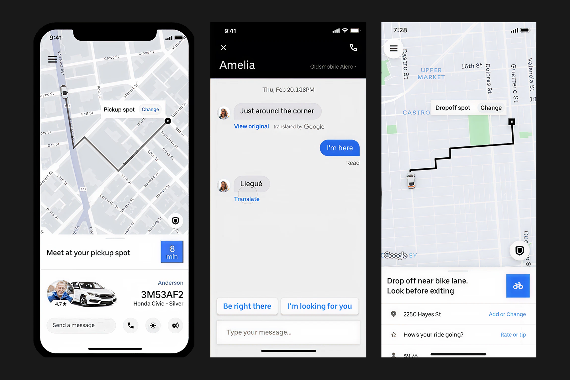
Besides, one can also use the app in one’s native language, if not comfortable in English.
Typography also plays a role. A global interface has to handle different scripts, lengths, reading habits, and screen sizes without breaking clarity. Text that looks neat in English may become longer in another language.
Multilingual UX is about keeping the experience understandable when language changes. And Uber gets it right.
Minimal design helps when the task is urgent
Uber’s interface is mostly practical because the task is practical.
People usually open the app with a need already in mind. They may be late, tired, standing outside, carrying luggage, leaving an airport, or trying to get home. In that moment, the design cannot ask for too much attention.
This is why a minimal and accessible interface works well for Uber. The app keeps the key actions visible. It shows the driver profile clearly. It uses the map as the anchor. It gives the rider enough information to feel aware of the trip without crowding the screen.
That simplicity supports cross-cultural use too.
Designing for Everyone
A product can be consistent without becoming culturally blind. It can adapt and keep the same core experience while respecting the different ways people trust, move, pay, and communicate.
At SandCup, we see cross-cultural design as a balance between system clarity and local understanding.
The core product should stay stable enough to build confidence. The surrounding experience should be flexible enough to respect real behaviour.
Uber’s success comes from the real design lesson that the product feels familiar enough to use, and local enough to trust, from any corner of the globe!
Be a part of our world and gain more insights on design and innovation!